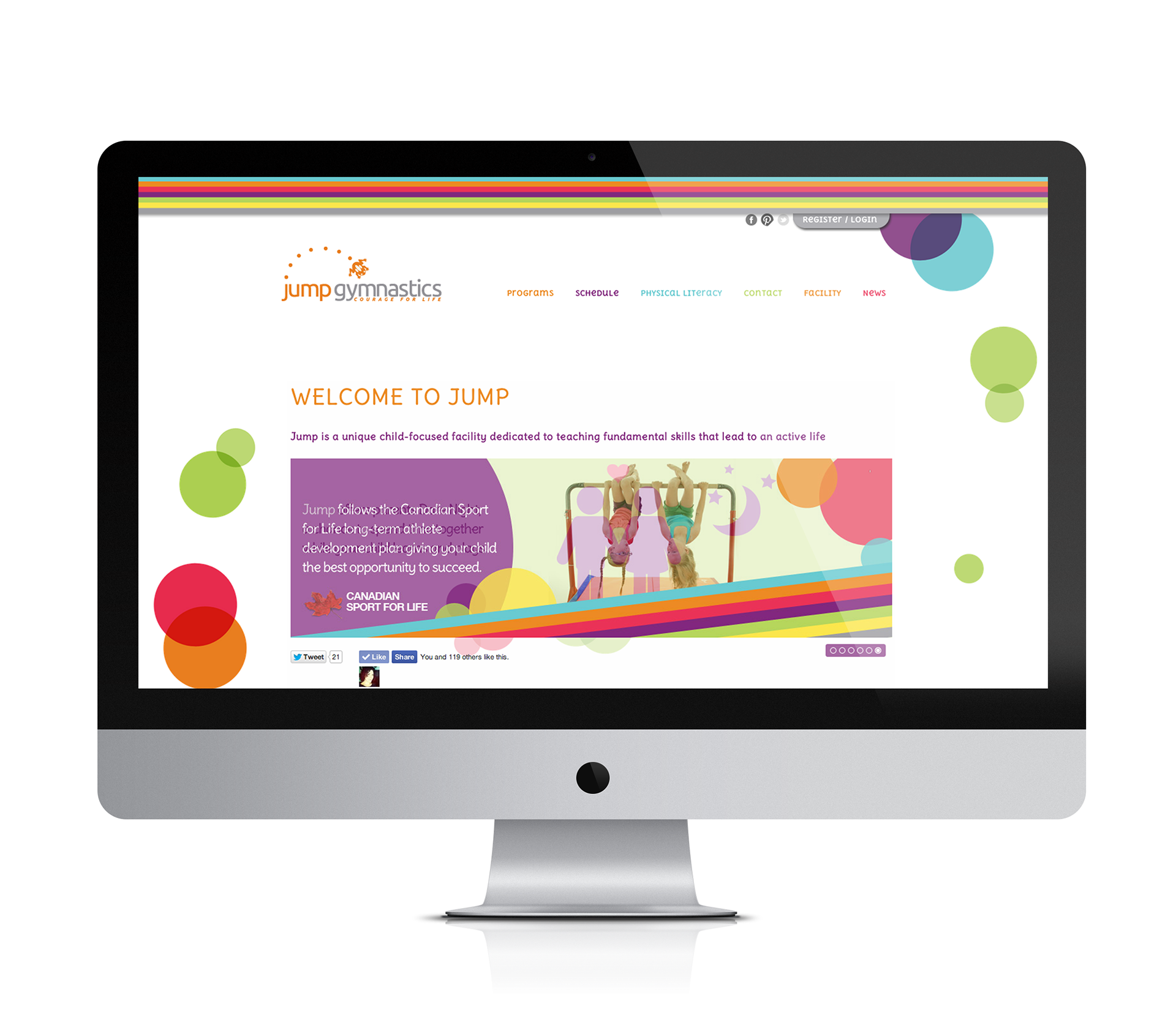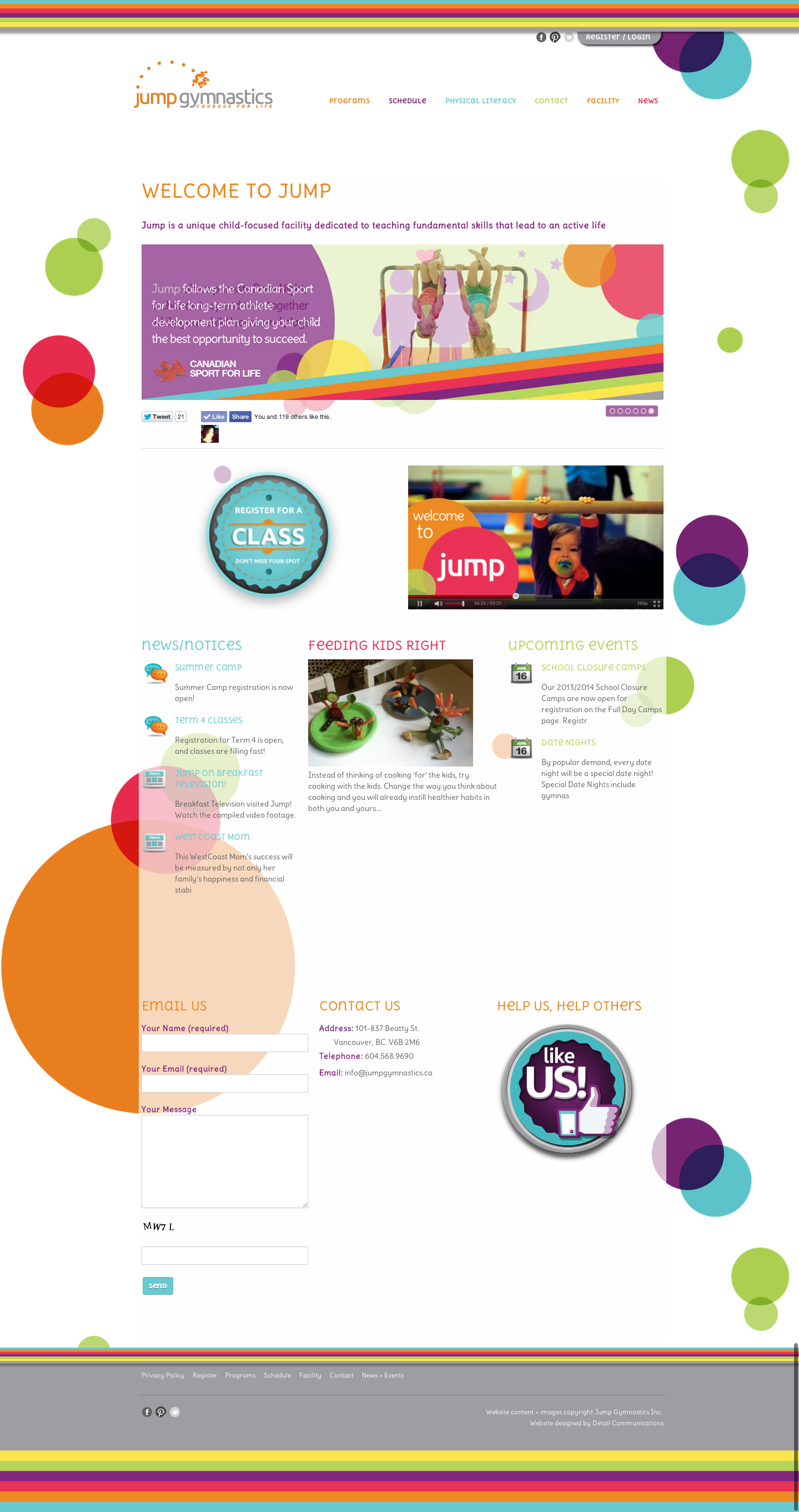
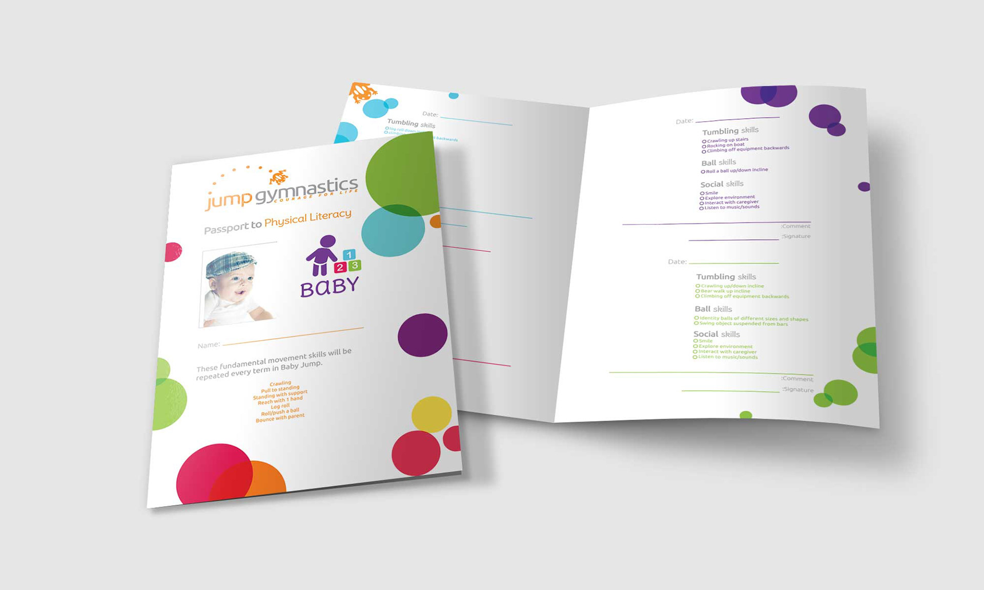
Jump is a unique facility that teaches physical literacy.
A combination of fundamental movement skills and fundamental sports skills.
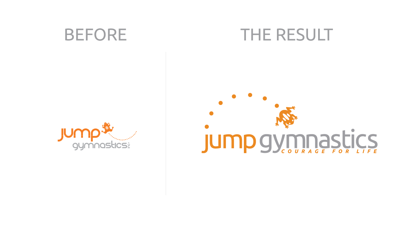
The Jump visual identity refresh was not to deviate too far from the original logo mark.
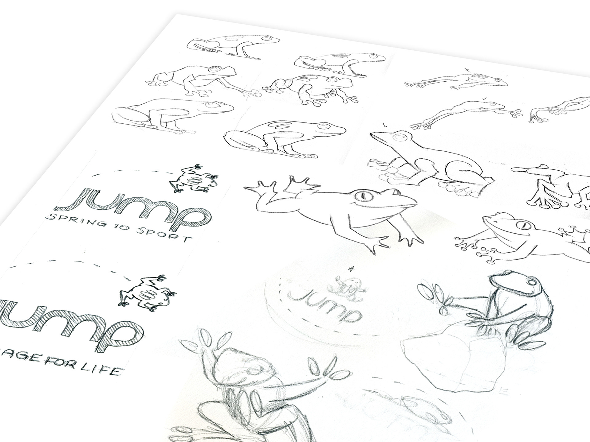
Jump wanted to let their customers know that the facility was progressing forward but sticking to fundamentals of what made Jump a great place to be. The identity involved addressing some anatomical issues with the previous iconic frog (legs were reversed and appeared broken.)
The addition of the stripes and circles together are representative of the positive direction, mobility, and energy of the Jump brand. They symbolize the wholeness and embrace of everything that Jump provides when introducing children to Physical Literacy.
The stripes are representative of progress and moving forward.

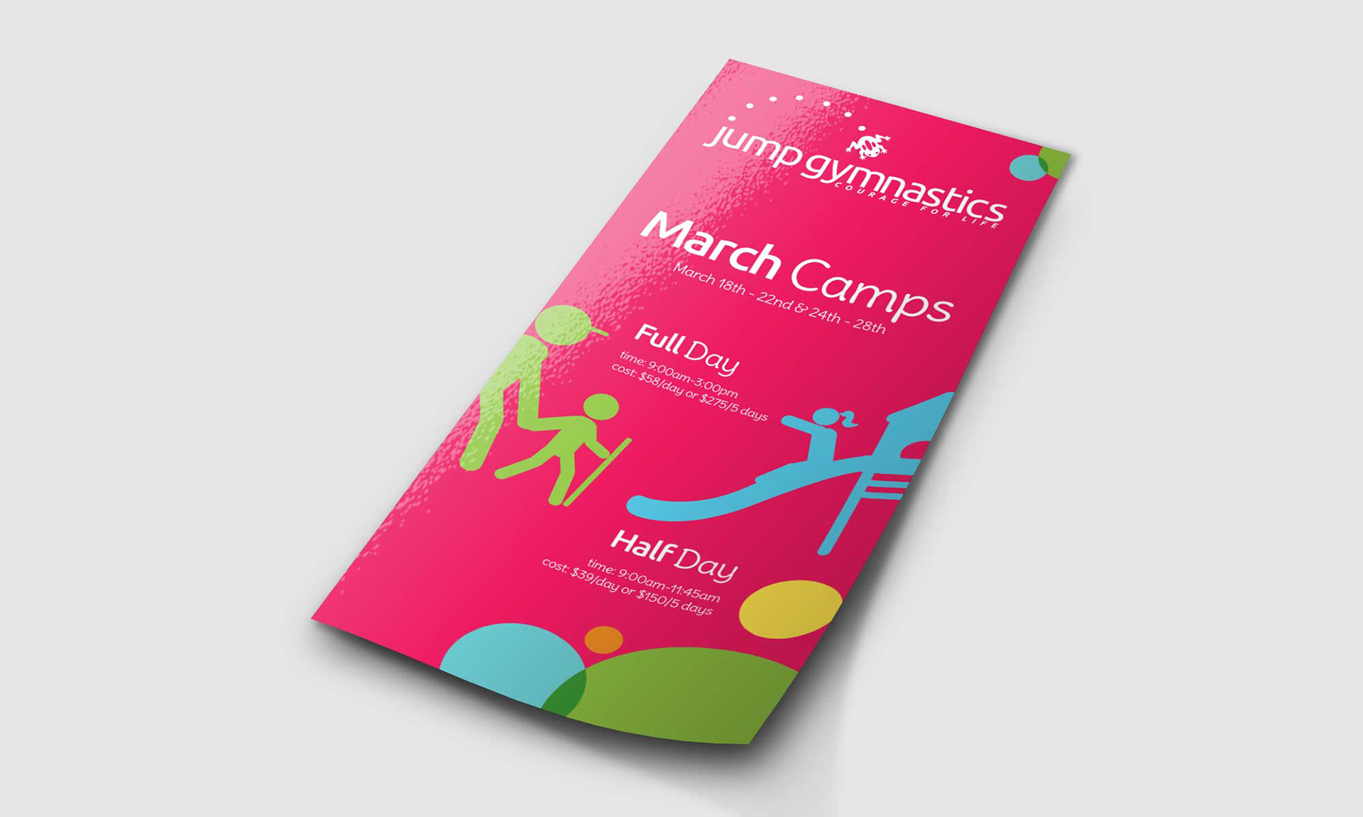
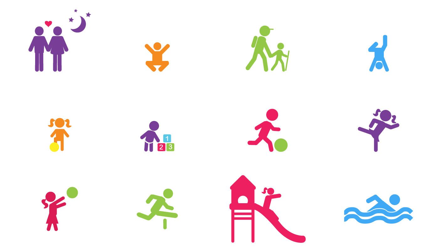
JUMP ICONOGRAPHY
A series of icons were created to visually complement and align the programs with the Jump identity.
The iconography was inspired by the Olympics and how the sports are visually represented to an
international audience, easily distinguishable and representative of what they stand for.
international audience, easily distinguishable and representative of what they stand for.